Dashboard
The Dashboard provides a comprehensive overview of your organization's IT asset inventory. It is the first page displayed after logging in and is accessible from the top of the sidebar.
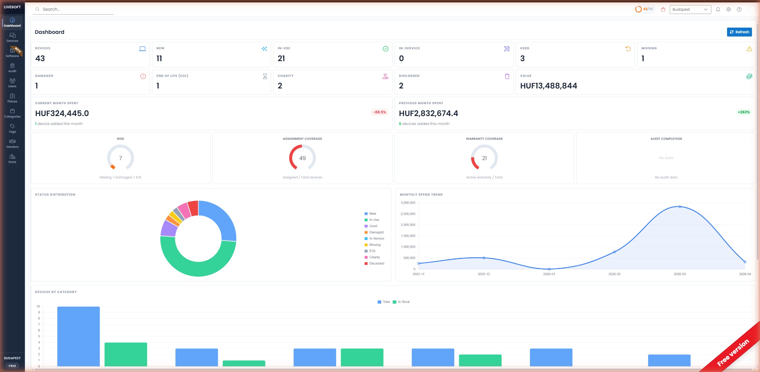
Status Summary Cards
At the top of the Dashboard, status cards display real-time counts for each device status:
| Card | Description |
|---|---|
| Devices | Total number of devices across all statuses |
| New | Recently added devices not yet assigned |
| In-Use | Devices currently assigned to employees |
| In-Service | Devices undergoing maintenance or repair |
| Used | Previously used devices returned to inventory |
| Missing | Devices reported as lost or unaccounted for |
| Damaged | Devices with reported damage |
| End of Life (EOL) | Devices that have reached end-of-life |
| Charity | Devices allocated for charity campaigns |
| Discarded | Devices permanently removed from service |
| Value | Total monetary value of all devices in the default currency |
Clicking any status card filters the Devices page to show only devices with that status.
Spending Overview
- Current Month Spent — Total cost of devices added in the current calendar month.
- Previous Month Spent — Total cost of devices added in the previous calendar month, with a percentage change indicator (green = increase, red = decrease).
You can set your display currency in Settings → Invoice & Currency under Default Currency.
Key Metrics
Four gauge charts provide at-a-glance insight into your inventory health:
- Risk — Count of Missing + Damaged + EOL devices that require attention.
- Assignment Coverage — Percentage of devices assigned to employees or places versus total devices.
- Warranty Coverage — Ratio of devices with an active warranty versus total devices.
- Audit Completion — Progress of the most recent inventory audit.
Status Distribution
A donut chart showing the proportional breakdown of devices by status (New, In-Use, Used, Damaged, In-Service, Missing, EOL, Charity, Discarded).
Monthly Spend Trend
A line chart visualizing device procurement costs over the past several months, helping you identify seasonal patterns and budget trends.
Devices by Category
A bar chart comparing the total number of devices versus devices currently In Stock for each category (e.g. Laptop, Keyboard, PC, Monitor). Use this to spot categories where you are running low on spare stock.
Inventory and Tags
At the bottom of the Dashboard:
- Inventory — Summary of device inventory across categories.
- Tags — Overview of tagged devices and their distribution.